Design, Typography & Visual Management (12)
The Art of Font Pairing: Harmony and Contrast
Rules for establishing harmonious font pairings between headlines, subheads, and body copy.
What will you find in this guide?
- Master typographic relationship models (Concord, Contrast, Conflict).
- Pair display serifs with humanist sans body copy and vice versa with precision.
- Enforce the strict rule of limiting publications to 2 (or maximum 3) cohesive type families.
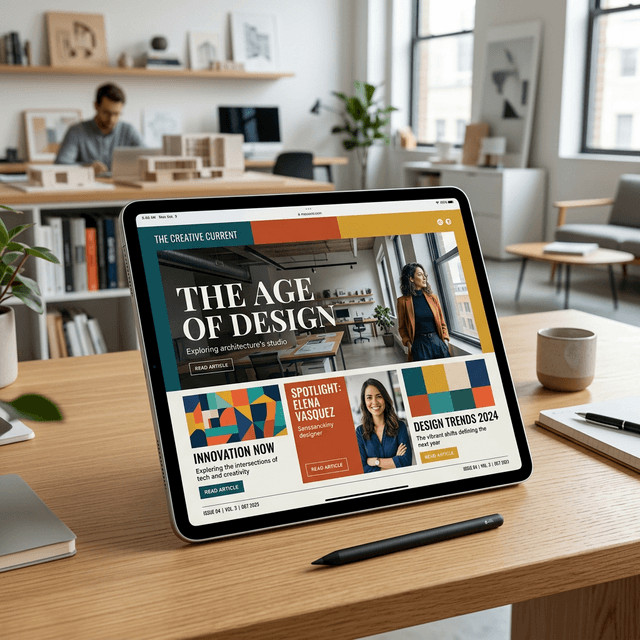
Font Pairing: The Art of Typographic Symphony
Pairing typefaces is an exercise in relational alchemy: identical styles breed visual monotony, while jarringly disconnected styles produce cognitive chaos. The supreme objective is Harmonious Contrast.
Three Benchmark Editorial Typographic Pairings
-
The Cultural & Literary Benchmark:
- Display Headline: Playfair Display or Ogg (Expressive, Romantic Didone Serif)
- Body Copy: Inter or Source Sans 3 (Neutral, Hyper-Legible Humanist Sans)
-
The Modern Architectural Review:
- Display Headline: Neue Haas Grotesk / Syne (Authoritative Swiss Grotesk)
- Body Copy: EB Garamond or Freight Text (Warm, Historic Book Serif)
-
The Slow Luxury & Design Journal (Kinfolk School):
- Display Headline: Cormorant Garamond (Delicate, High-Contrast Classical Serif)
- Body Copy: DM Sans or Jost (Light)
[!CAUTION] The Three-Family Ceiling: Never exceed three distinct font families within a single publication. When you require hierarchical diversity, leverage variations (Italic, Medium, Bold, Condensed, Small-Caps) within your chosen families.
Key Takeaways
Never pair typefaces that are subtly similar (creates visual conflict); seek decisive, intentional contrast.
Deploy expressive, high-personality typefaces for headlines; preserve neutral legibility for body text.
Leveraging diverse weights (Hairline to Ultra Black) within a single super-family is always fool-proof.