Layout and Grid Systems: Building Visual Hierarchy
Swiss graphic design school, 12-column grid architecture, and page cadence. Turning complex texts into visual balance.
What will you learn?
- Master the principles of Swiss Graphic Design and the International Typographic Style.
- Calculate modular 12-column grids, baseline grids, and golden proportion margins.
- Direct ocular movement across double-page spreads using Z-patterns and F-patterns.

Grid Systems: The Invisible Architecture of Editorial Spreads
In 1950s Switzerland, visionaries like Josef Müller-Brockmann and Emil Ruder formulated the International Typographic Style (Swiss Style). Their core premise remains revolutionary: Masterclass design is not the product of decorative whim, but of mathematical order, rational balance, and modular grid architecture.
When a reader opens a magazine spread and experiences effortless clarity, they are engaging with a rigorously calculated grid.
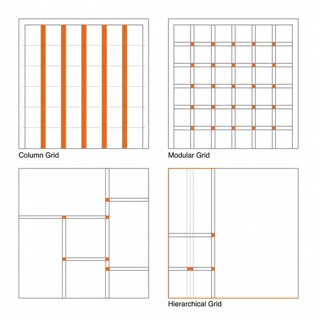
Anatomy of an Editorial Grid
- The 12-Column Modular Grid: Divisible by 2, 3, 4, and 6, the 12-column grid is the ultimate editorial foundation. It allows an 8-column hero visual to coexist seamlessly with a 3-column body text block below.
- The Baseline Grid: The typographic heartbeat. Typically locked to increments of 12pt or 14pt, it ensures that every line of text across adjacent columns aligns with mathematical precision.
- Proportional Margins & Gutter Architecture: The inner gutter (binding allowance), outer margins, and headers must balance. The inner margin is calibrated narrower than the outer margin to maintain equilibrium across double-page spreads.
The Ocular Journey: Z-Patterns and F-Patterns
- Primary Entry (Hero Visual): The human eye invariably lands first on the highest-contrast visual anchor.
- Secondary Capture (Display Headline): The primary thematic typography and sub-headline.
- Tertiary Scanning (Pull-Quotes & Captions): High-yield callout quotes and image annotations.
- Sustained Flow (Body Text): Deep reading column immersion.
InDesign & Figma Directive: Never place assets by subjective guesswork. Establish your baseline guides, lock your column grid, and snap all frames to this structural skeleton. You must master the grid completely before you earn the right to break it.
Key Takeaways
A grid is not a prison; it is the invisible architectural framework that enables true creative freedom.
A baseline grid guarantees microscopic alignment of text baselines across adjacent columns.
The dominant hero image anchors ocular entry; the eye flows to the headline, then smoothly into body copy.
The Culture of Whitespace: Letting Design Breathe
Whitespace is not empty space; it is the ultimate hallmark of luxury, clarity, and intellectual prestige.
or continue scrolling down