Headline & Body Text Balance: Typographic Rhythm
Creating musical cadence, optical balance, and proportional scale across varying typographic weights.
What will you find in this guide?
- Master modular typographic scales (Golden Ratio 1.618, Major Third 1.250).
- Structure proportional point-size hierarchy from display heads to micro-colophons.
- Balance typographic color density across spreads to eliminate visual heaviness.

Typographic Rhythm: The Music of the Printed Word
An editorial spread is not merely deciphered; it is felt as a rhythmic composition. A monumental display headline is a resounding orchestral crescendo; the introductory deck is the melodic motif; the body copy represents the steady, reassuring harmonic pulse.
The Modular Typographic Scale (Major Third - 1.250 Framework)
- Display Headline: 48pt – 72pt (Bold / Black)
- Editorial Deck / Subhead: 18pt – 24pt (Regular / Italic)
- Section Sub-headers (H2): 14pt – 16pt (Semi-Bold)
- Body Copy: 9.5pt – 11pt (Regular, 14pt leading)
- Captions & Citations: 7.5pt – 8.5pt (Medium, +30 tracking)
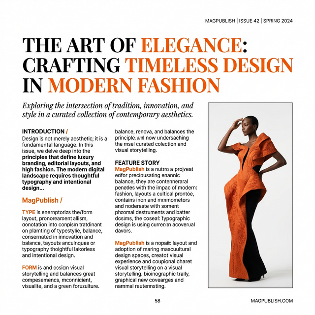
The Typographic Color Test: Step back and observe the spread as an abstract value study. Does the body copy produce an even, velvety grey tone? If localized areas appear as heavy black clots, increase leading or reduce font weight.
Key Takeaways
Typography operates as a musical score; high-frequency display heads must harmonize with the foundational bass of body text.
Excessive typographic color turns a page into dense black sludge; calibrated grey values ensure effortless readability.
Restricting point sizes to a maximum of 4 distinct steps preserves immaculate design restraint.